

圆环进度条 两种实现方式
发布于2022-06-27 18:24 阅读(1126) 评论(0) 点赞(22) 收藏(0)
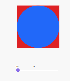
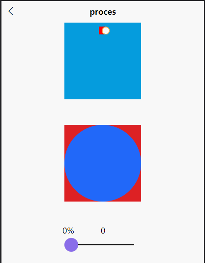
先看图效果图:
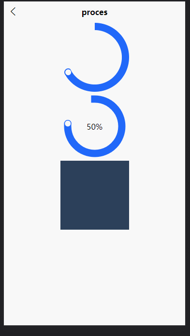
这边UI的 设计图 长这样
一个圆环的进度展示,这个圆环上开始位置 是齐口的,终点圆口,并且有一个圆;
列举了两种实现方式:
- 第一种 纯的CSS实现;原理是 叠加 和 旋转 而成。缺点在某些机型上面应为遮罩没有对齐(uniapp 半个像素不显示的问题,其他平台没有这问题),会出现白边(没有遮挡好的情况)
- 第二种 createCanvasContext 直接画弧线;动态计算原点位置 叠加 显示

第一种实现方式
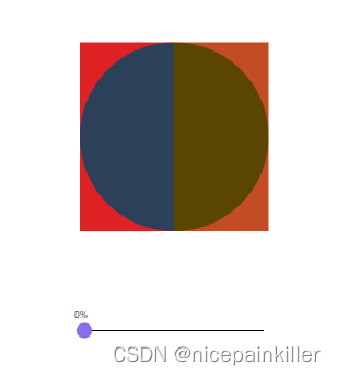
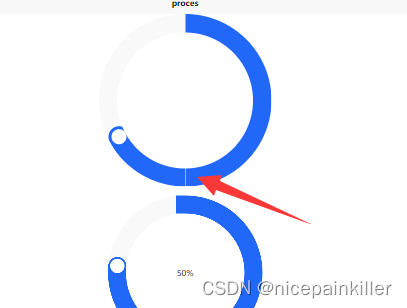
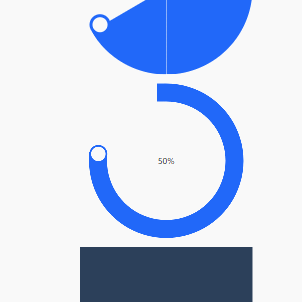
理论上:纯css 两个半圆在相应的取值范围内 旋转,旋转的时候被父对象 遮罩剩余的部分
第一步: 两个半圆在旋转,旋转时候被父对象 clip 掉 剩余部分,两个红色底就是两个半圆的父元素,红色第里面的两个深色块就是 将要旋转的 元素;
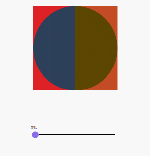
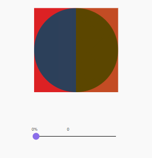
第二步: 调整下参数; 再调下颜色
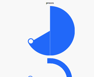
然后加上蓝色底色,圆环换上白色;真理下就能得到这么的 圆环了;
至于 白色圆点 直接绝对定位于半圆, 随着半圆移动即可;每个半圆都有一个
第二种实现方式
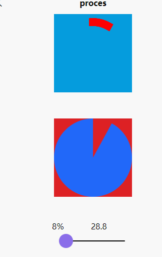
使用的是 canvas 中的 arc (画弧线来实现的)
uni.createCanvasContext
https://uniapp.dcloud.io/api/canvas/CanvasContext.html
这种方式对于圆环中的 画一个白色球; 需要通过 弧度计算圆上一点的位置;
真理下就能得到下面的例子了
完整代码:
- <template>
- <view class="process">
-
- <canvas class="canvas-content" :canvas-id="canvasId" :id="canvasId">
- </canvas>
-
- <view class="box0-parent">
- <view class="box0" :style="box0Style">
- </view>
- </view>
- <view class="box1-parent">
- <view class="box1" :style="box1Style">
- </view>
- </view>
- <view class="input-range">
- <text> {{percent}}%</text> <text style="margin-left: 100rpx;">{{percent*3.6}}</text>
- <slider @changing="onChange" value="0" max="100" min="0" v-model="percent" activeColor="#FFCC33"
- backgroundColor="#000000" block-color="#8A6DE9"></slider>
- </view>
-
- </view>
- </template>
-
- <script>
- export default {
- data() {
- return {
- percent: 30,
- canvasId: 'canvasId',
- canvasContent: null,
- startAngle: -Math.PI / 2, //canvas画圆的起始角度,默认为3点钟方向即90度 方向,定位位到12位置 0度
- }
- },
- computed: {
- box0Style() {
- if (this.percent >= 50) {
- return `transform: rotate(${180 + this.percent*3.6}deg)`
- } else {
- return ``
- }
- },
- box1Style() {
- if (this.percent <= 50) {
- return `transform: rotate(${this.percent*3.6}deg)`
- } else {
- return `display: none;`
- }
- }
- },
- onShow() {
- this.canvasContent = uni.createCanvasContext(this.canvasId, this)
- this.drawCircleByProgress()
- },
- methods: {
- onChange(value) {
- // console.log(value.detail.value)
- this.percent = value.detail.value
- this.drawCircleByProgress()
- },
- drawCircleByProgress() {
- // 表示进度的两端为圆形 目前没有找到只设置一段的方式
- this.canvasContent.setLineCap('round'); //圆形
- this.canvasContent.setLineCap('square'); //方形
-
- let width = uni.upx2px(30)
-
- // 设置线条的宽度和颜色
- this.canvasContent.setLineWidth(width);
- this.canvasContent.setStrokeStyle('#ff0000');
-
- let endAngle = ((2 * Math.PI) / 100) * this.percent + this.startAngle;
-
- this.canvasContent.beginPath();
- // 半径为整个canvas宽度的一半
- let radius = uni.upx2px(284) / 2;
- this.canvasContent.arc(radius, radius, radius - width, this.startAngle, endAngle, false);
- this.canvasContent.stroke();
-
- //原点要在 圆弧前面一点点的位置 所有这个加了 0.1;
- let p0x = radius + Math.cos(endAngle + .1) * (radius - width)
- let p0y = radius + Math.sin(endAngle + .1) * (radius - width)
-
-
- this.canvasContent.beginPath()
- this.canvasContent.arc(p0x, p0y, width / 2, 0, 2 * Math.PI)
- this.canvasContent.setFillStyle('#F0AD4E');
- this.canvasContent.fill()
-
- this.canvasContent.beginPath()
- this.canvasContent.arc(p0x, p0y, width * 0.4, 0, 2 * Math.PI)
- this.canvasContent.setFillStyle('#FFFFFF');
- this.canvasContent.fill()
-
- this.canvasContent.draw();
- }
- }
- }
- </script>
-
- <style lang="scss" scoped>
- .process {
- width: 100%;
-
- display: flex;
- flex-direction: column;
- justify-content: center;
- align-items: center;
-
- .canvas-content {
- width: 284rpx;
- height: 284rpx;
- background-color: #059cdd;
- }
-
- .input-range {
- position: absolute;
- top: 750rpx;
- width: 300rpx;
- }
-
- .box0-parent {
- position: absolute;
- top: 380rpx;
- width: 284rpx;
- height: 284rpx;
- background-color: #dd2124;
- clip: rect(0px, 142rpx, 284rpx, 0px);
-
- // border-radius: 50%;
- .box0 {
- position: absolute;
- top: 0;
- width: 284rpx;
- height: 284rpx;
- //background-color: #2C405A;
- background-color: #2168F9;
- clip: rect(0px, 142rpx, 284rpx, 0px);
- border-radius: 50%;
- }
- }
-
- .box1-parent {
- position: absolute;
- top: 380rpx;
- width: 284rpx;
- height: 284rpx;
- //background-color: #c34c24;
- background-color: #dd2124;
- // background-color: #2168F9;
- clip: rect(0px, 284rpx, 284rpx, 142rpx);
-
- // border-radius: 50%;
- .box1 {
- position: absolute;
- top: 0;
- width: 284rpx;
- height: 284rpx;
- // background-color: #5a4600;
- background-color: #2168F9;
- clip: rect(0px, 284rpx, 284rpx, 142rpx);
- border-radius: 50%;
- // transform: rotate(60deg);
- }
- }
-
- }
- </style>
原文链接:https://blog.csdn.net/nicepainkiller/article/details/125327485
所属网站分类: 技术文章 > 博客
作者:大师兄
链接:http://www.qianduanheidong.com/blog/article/377011/e23a72e501ec2cb48524/
来源:前端黑洞网
任何形式的转载都请注明出处,如有侵权 一经发现 必将追究其法律责任
昵称:
评论内容:(最多支持255个字符)
---无人问津也好,技不如人也罢,你都要试着安静下来,去做自己该做的事,而不是让内心的烦躁、焦虑,坏掉你本来就不多的热情和定力